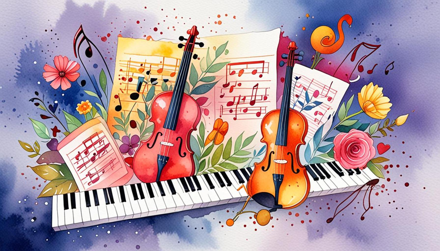
Using Colors to Convey Emotions in Artistic Works A Guide
The Powerful Influence of Colors on Emotional Perception
Colors are much more than mere visual elements; they are powerful tools that can evoke a spectrum of emotions. From the warm embrace of reds and oranges to the serene calmness of blues and greens, the hues we encounter in artistic works carry profound significance. The relationship between color and emotion is not merely an observation; it is a nuanced exploration of how our brain interprets these visual cues.
Psychological Effects: Different colors can trigger specific feelings, like happiness, sadness, or anger. For example, the color blue is often associated with feelings of tranquility and peace, reminiscent of a clear sky or calm waters. On the other hand, bright reds can incite excitement or urgency, commonly used in marketing to prompt action. This psychological tether to color influences everything from consumer behavior to mood regulation, reinforcing the profound impact color has on our lives.
Cultural Associations: Colors can have varied meanings across cultures, enhancing or altering their emotional impact. In Western cultures, white is typically associated with purity and innocence, often featured in weddings. Conversely, in some Asian cultures, white signifies mourning and loss. Thus, understanding these cultural nuances is essential for interpreting the emotional weight of color in both artwork and everyday life.
Contextual Usage: The surrounding elements in a piece can dramatically change how colors are interpreted. A stark red painted against a muted background may elicit a sense of urgency and focus, whereas the same red in a lively, colorful scene may transform into an expression of joy or creativity. This interplay serves as a reminder that color exists within a broader context, shaping its potential emotional resonance.
Artists throughout history have skillfully utilized color theory to shape their narratives. Famous painters like Vincent van Gogh and Pablo Picasso demonstrate a keen awareness of color’s emotional resonance. Van Gogh’s use of vibrant yellows in “Sunflowers” invokes warmth and happiness, while Picasso’s “Blue Period” captures deep melancholy through somber shades of blue, showcasing how effectively color can express complex emotional states.
In this guide, we will delve into:
- How to identify emotional cues in various artworks.
- Examples of color palettes in famous pieces.
- Practical tips for artists seeking to communicate feelings through color.
Join us as we unlock the secrets of using colors to convey emotions in artistic works, empowering your creativity and enhancing your understanding of art’s emotional landscape. Engaging with colors and their meanings can lead not only to a deeper appreciation of art but also to a more profound understanding of our own emotional reactions to the world around us.
CHECK OUT: Click here to explore more
Understanding Emotional Cues Through Color
Delving into the emotional influence of color in art begins with recognizing how various colors can evoke specific sentiments. Each hue carries with it a psychological weight that can elicit reactions ranging from joy to sadness, courage to fear. Colors are not just aesthetic choices; they form a vital part of the storytelling in visual art, offering insight into the artist’s intentions and the emotions they seek to evoke.
Identifying Emotional Themes: One of the first steps in deciphering the emotional language of color is to look for recurring themes within a piece. For instance, an artist might choose a predominance of cool tones, such as blues and greens, signaling themes of tranquility or isolation. In contrast, the use of warm hues, like yellows and reds, typically instills feelings of warmth, enthusiasm, or urgency. Analyzing these patterns can provide deeper insight into the emotional undercurrents at play in an artwork.
Furthermore, viewers must consider how color not only reflects the artist’s emotional palette but also creates a dialogue with the observer. The colors an artist chooses can shape the viewer’s interpretation and emotional reaction, almost like a visual conversation. Such interactions invite the audience to engage on a personal level, drawing from their own experiences and memories.
The Role of Color Palettes: Color palettes are critical in showcasing emotional depth. Artists often employ distinct palettes to convey different moods or themes. For example, the monochromatic blues present in Picasso’s “Blue Period” express profound sorrow and detachment, while the vibrant, chaotic palette in his later works reflects a more exuberant, lively disposition. Here are some common color associations found in artistic palettes:
- Red: Passion, intensity, and anger.
- Orange: Energy, enthusiasm, and warmth.
- Yellow: Happiness, optimism, and cheerfulness.
- Green: Nature, renewal, and tranquility.
- Blue: Calmness, sadness, and introspection.
- Purple: Luxury, creativity, and mystery.
- Black: Power, elegance, and mourning.
Recognizing these associations enables artists to carefully choose their color combinations to imprint specific emotions upon their audience. In contemporary art, where the lines between genres are often blurred, artists might play with unexpected color pairings to challenge prevailing emotional interpretations. This experimentation not only revitalizes the emotional response to the work but invites viewers to rethink conventional associations.
As we navigate through the complex world of colors in art, it’s essential to understand that while there are general emotional reactions associated with particular hues, individual perception might vary widely. Engaging with artistic works through the lens of color opens new trenches of emotional understanding, prompting a personal exploration of how these colors resonate within us.
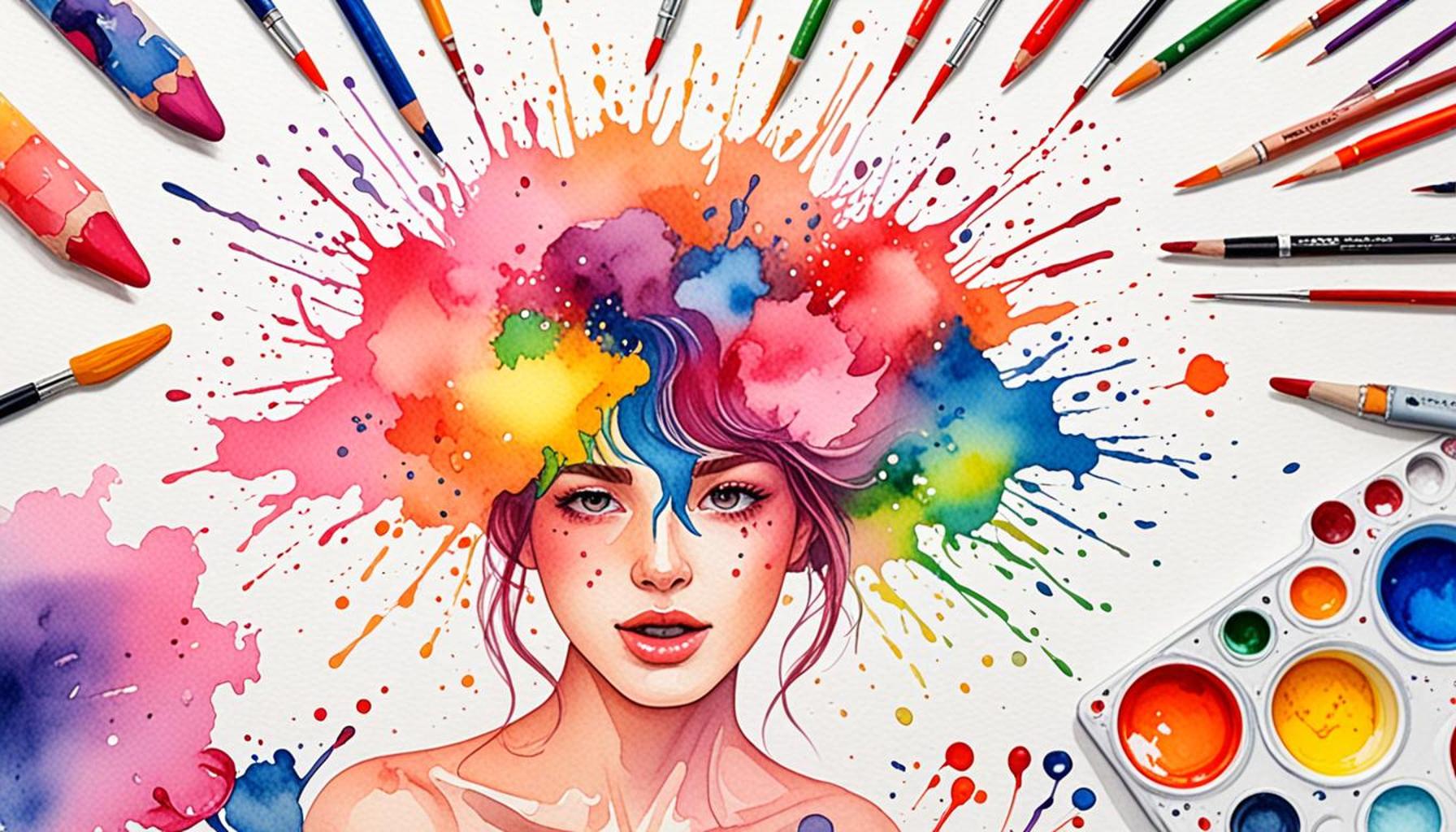
Understanding the Psychology of Color
Color is an essential element in artistic expression, possessing the power to evoke a wide spectrum of emotions. From the calm tranquility of blue to the fiery passion of red, each color conveys unique feelings that artists intentionally utilize to enhance their work. In this section, we delve deeper into how colors interact with human psychology and the profound impact they have on the viewer’s perception.
For instance, blue is often associated with serenity and peace, making it a popular choice for landscapes and seascapes. Artists might employ varying shades of blue to create a sense of depth or to induce a feeling of calmness in the observer. In contrast, red often symbolizes passion, urgency, or even anger, prompting viewers to respond emotionally to the artwork. This vivid contrast between colors creates tensions or harmonies that can lead to a complex emotional experience for the audience.
Examples of Color Use in Artistic Works
Many renowned artists have effectively used color to communicate emotions. For example, Vincent van Gogh’s painting, “Starry Night,” employs swirling hues of blue and yellow to elicit feelings of turmoil and beauty, demonstrating how contrasting colors can enhance the emotional narrative within a piece. Similarly, Picasso’s Blue Period uses monochromatic blue to express themes of sadness and despair, illustrating how a limited color palette can powerfully convey mood.
As artists learn to manipulate color, they encounter a rich vocabulary that extends beyond mere aesthetics. Each hue, shade, and tint serves as an emotional brushstroke on the canvas of human experience. By understanding this psychological language of color, creators can become more adept at engaging their audience and provoking thought or reflection.
The Significance of Cultural Context
It’s essential to consider cultural context when discussing color and emotion. For example, while white symbolizes purity in many Western cultures, it is associated with mourning in some Eastern traditions. This disparity illustrates that the interpretation of color is not universally fixed but rather influenced by societal norms and personal experiences. Artists and audiences alike must navigate this relative terrain, understanding that their emotional reactions to color can vary widely based on their backgrounds.
As we explore the multifaceted relationship between color and emotion, it becomes clear that the application of color in art is a profound and intricate dance. Artists wield this power intentionally, crafting their pieces to ensure that every brushstroke resonates with the audience on an emotional level. For further exploration of this captivating subject, we invite you to consider how colors weave together stories and feelings in modern artistic expressions.
| Color Category | Emotional Impact |
|---|---|
| Blue | Calmness and serenity, perfect for tranquil compositions |
| Red | Passion and urgency, creating strong emotional reactions |
| Yellow | Joy and optimism, often used to brighten compositions |
| Green | Growth and harmony, invoking a sense of balance |
CHECK OUT: Click here to explore more
The Intersection of Culture and Color in Art
The emotional impact of color in art does not exist in a vacuum; it is profoundly influenced by cultural contexts. Different cultures often ascribe varied meanings to colors, which can significantly alter the emotional experience of a piece. For instance, in Western cultures, white is primarily associated with purity and innocence, often seen at weddings and celebratory events. Conversely, in many Eastern cultures, white is linked to mourning and loss, as it is traditionally worn in funerals. Understanding these cultural nuances is essential for appreciating how color can convey complex emotions in artistic works across the globe.
Color Symbolism in Various Cultures: The symbolism tied to colors can be a rich source of inspiration for artists and an invaluable tool for interpreting artworks. A quick glance at some color meanings reveals the depth of this relationship:
- Red: In China, red symbolizes good fortune and joy, making it a popular color for celebrations. However, in the context of politics, red can also embody revolution and danger.
- Blue: In many African cultures, blue conveys calmness and is often associated with spirituality. Conversely, in Western settings, it can express feelings of melancholy.
- Green: In Islam, green represents paradise and is deeply revered, while in other contexts, it might indicate jealousy or envy.
- Yellow: While often associated with happiness in Western art, in some instances, it symbolizes caution or cowardice, such as in the term “yellow-bellied.”
By weaving these cultural interpretations into their works, artists create multifaceted emotional landscapes, inviting viewers to navigate a rich tapestry of meanings and feelings.
Color Interactions and Combinations
The emotional resonance of colors can also be significantly altered by their interactions and combinations. This is where color theory provides artists with a powerful framework to create emotional depth. Contrast and harmony play essential roles in color relationships, influencing how emotions are perceived within any given artwork.
Complementary Colors: Colors opposite each other on the color wheel, known as complementary colors, can generate high contrast and energy in artwork, often evoking feelings of vibrancy and excitement. For instance, the interplay of orange and blue can create a sense of dynamism, reflecting a narrative filled with movement and passion. Artists like Van Gogh employed such combinations to capture the emotions tied to his subjects dynamically.
Analogous Colors: On the other hand, using analogous colors—those adjacent to each other on the color wheel—can evoke harmony and tranquility. For instance, a palette of soft greens, blues, and yellows might create a serene landscape, promoting feelings of peace and relaxation. Such subtleties demonstrate the artist’s ability to guide the viewer’s emotional journey through color synergy.
Moreover, the intentional layering of colors can generate complexity and depth. In mixed media and abstract art, for example, artists experiment with different materials and hues to create a sense of movement within their work. This layered approach can force viewers to confront their feelings and perceptions, evoking personal reflections that enrich emotional engagement.
As artists continue to explore the intersections of culture, interaction, and emotional color theory, the dialogue between color and emotion in art remains an ever-evolving space. Drawing upon personal experiences and societal influences, the use of color becomes a bridge between the artist’s inner world and the emotional landscape of the viewer, crafting an experience that is both individual and universal.
SEE ALSO: Click here to read another article
Conclusion: The Power of Color in Artistic Expression
In wrapping up this exploration of using colors to convey emotions in artistic works, it becomes clear that color serves as a profound language within the realm of art. The interplay of hues, shades, and combinations provides artists with a toolkit for expressing complex emotional narratives that resonate deeply with viewers. From the vibrant energy of complementary colors to the soothing harmony found in analogous palettes, each color choice shapes the emotional landscape of an artwork, inviting personal reflections and societal conversations.
Additionally, the cultural significance tied to colors adds another layer of meaning and emotional impact. Understanding the diverse interpretations of colors across cultures helps artists craft more nuanced messages while enabling audiences to engage with art on a deeper level. This rich dialogue highlights how color not only enhances aesthetics but also evokes feelings ranging from joy and serenity to sorrow and conflict.
As we immerse ourselves in the world of color theory, we uncover an intricate tapestry woven together by subjective experiences and shared human emotions. For artists, this means endless opportunities to experiment and innovate, creating works that speak universally while still honoring personal narratives. For viewers, it beckons an invitation to look beyond the surface and unlock the emotional depths of creative expression.
Ultimately, as you continue your journey through the captivating realm of color in art, consider how these visual elements influence your emotions and perceptions. Embrace the vibrancy and diversity of colors, and let them guide you through the myriad experiences that artistic works offer in both personal and collective contexts.